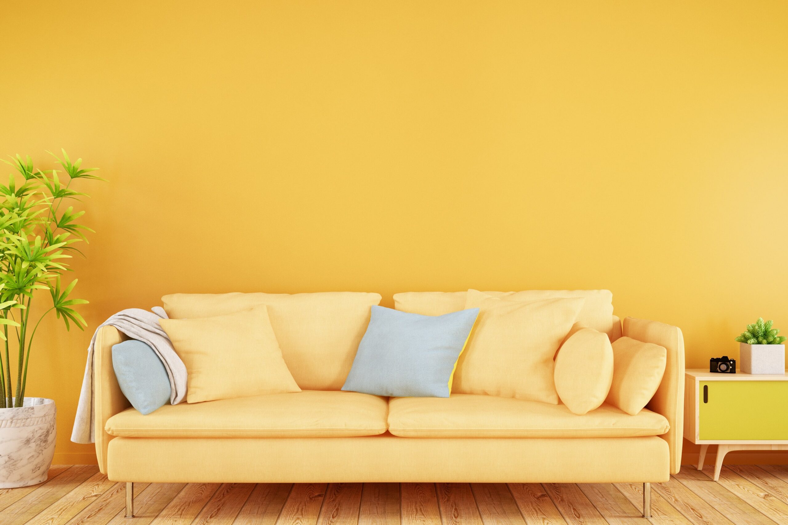
Warm colors, often associated with fire, heat, and sunlight, are a key element in design, art, and interior spaces. These hues evoke feelings of warmth, energy, and comfort, and they play an essential role in influencing emotions and setting the mood of a space. This article will explore what colores calidos are, their psychological effects, and how they can be used effectively in various applications, including interior design, branding, and fashion.
What Are Warm Colors?
Warm colors are those hues found on the red, orange, and yellow side of the color wheel. They are often contrasted with cool colors, which are found on the blue, green, and violet side of the spectrum. The primary warm colors include:
- Red: Bold, passionate, and energetic.
- Orange: Lively, vibrant, and cheerful.
- Yellow: Bright, optimistic, and inviting.
These warm colors, along with their various shades and tints, bring life, warmth, and vibrancy to a design or space.
The Psychological Impact of Warm Colors
Each color has its own psychological impact and emotional associations, especially when it comes to warm hues. Understanding these effects can help you use them effectively in design or any other form of artistic expression.
1. Red: Passion, Power, and Excitement
Red is one of the most intense and emotionally charged colors. It’s often associated with love, passion, and danger. This color grabs attention immediately and is frequently used in design to create a sense of urgency or excitement. Red can also stimulate appetite, which is why it’s commonly seen in restaurants and food branding.
When to Use Red:
- To add bold accents to a room or design.
- To evoke passion and energy, especially in branding.
- To create a sense of urgency in marketing materials (sales, promotions).
2. Orange: Energy, Fun, and Enthusiasm
Orange combines the warmth of red with the cheerfulness of yellow. It’s a lively and playful color often associated with creativity, adventure, and enthusiasm. Orange can bring a sense of warmth to spaces, making it an excellent choice for areas where socialization and interaction are key, such as living rooms or kitchens.
When to Use Orange:
- In spaces where creativity and collaboration are essential.
- To add a playful and youthful vibe to a design.
- In marketing materials to convey energy and excitement.
3. Yellow: Optimism, Happiness, and Clarity
Yellow is the brightest of the warm colors and is often associated with sunshine, joy, and happiness. It is an uplifting and stimulating color that can evoke feelings of warmth and positivity. However, overuse of yellow can lead to feelings of anxiety, so it’s important to balance it with other colors.
When to Use Yellow:
- In spaces where you want to promote happiness and optimism, such as playrooms or kitchens.
- To grab attention and convey clarity in branding.
- To highlight important elements in a design or space without overwhelming.
Warm Color Palettes: Harmonizing and Combining Warm Tones
Warm colors can be used individually or in combination to create a cohesive palette. Here are some effective ways to combine warm colors for different effects.
1. Monochromatic Warm Palettes
A monochromatic color scheme involves using different shades and tints of one color. For instance, a room designed with varying shades of red can create a bold and cohesive look. Monochromatic palettes are ideal for minimalist designs where subtle variations of one hue create visual interest without overwhelming the space.
2. Analogous Warm Palettes
Analogous color schemes use colors that are next to each other on the color wheel. For a warm palette, this could mean combining red, orange, and yellow. This combination creates a harmonious and vibrant look. Analogous schemes are perfect for creating a cozy and welcoming environment, as the colors blend seamlessly and evoke a sense of unity.
3. Contrasting Warm and Cool Colors
While warm colors can create an inviting and energetic space, too much warmth can feel overwhelming. By pairing warm colors with cooler tones like blue or green, you can create a balanced, dynamic design. For example, a deep red paired with a cool teal can create a striking contrast that adds depth to the space.
Warm Colors in Interior Design
Warm colors play a crucial role in interior design, shaping the atmosphere and mood of a room. Here are some tips on how to effectively use warm colors in your home or workspace.
1. Living Rooms and Social Spaces
Warm colors like orange and red are perfect for living rooms and social spaces. These colors promote interaction, energy, and warmth. You can incorporate warm colors through furniture, accent walls, rugs, or accessories. For a more subdued look, opt for warmer neutrals like beige or terracotta.
2. Kitchens and Dining Areas
Since warm colors like red and yellow are known to stimulate appetite, they are often used in kitchens and dining areas. Consider using warm-toned cabinetry, countertops, or even vibrant dinnerware to create an inviting and appetizing environment.
3. Bedrooms and Relaxation Areas
In spaces intended for relaxation, it’s important to use warm colors sparingly. Opt for softer, more muted warm tones like coral, peach, or warm beige. These colors still offer warmth but won’t be too stimulating or intense for a restful space.
Warm Colors in Fashion
Fashion also benefits from the powerful impact of warm colors. Designers often use warm hues to make bold statements and convey emotions.
1. Red in Fashion
Red is often seen in evening wear and formal attire as it conveys power, confidence, and sensuality. It’s a color that can immediately make the wearer stand out, and it’s perfect for making a statement at events.
2. Orange and Yellow in Casual Wear
Orange and yellow are popular choices in casual and summer wear because of their playful and vibrant nature. These colors work well in fun patterns and accessories, adding energy and brightness to a wardrobe.
Warm Colors in Branding and Marketing
Brands often use warm colors in their logos and marketing materials to evoke specific emotions and drive customer engagement.
- Red is commonly used by brands to stimulate excitement and urgency. Think Coca-Cola or Target, where red draws attention and conveys a sense of urgency or action.
- Orange is often used by brands associated with creativity and energy, such as Nickelodeon and Fanta. It’s a color that appeals to younger audiences and those looking for fun.
- Yellow is used by brands that want to convey positivity and happiness, such as McDonald’s and Snapchat. It grabs attention and promotes a sense of joy and optimism.
Warm Colors in Art and Creativity
In art, warm colors can be used to convey emotion and movement. Famous artists like Vincent van Gogh and Henri Matisse often used warm tones to create dynamic, emotionally charged works. Warm colors can make a scene feel alive, whether it’s a fiery sunset or a vibrant cityscape.
1. Warm Colors for Mood
Artists use warm colors to evoke specific emotions from viewers. A painting filled with reds, oranges, and yellows can convey warmth, passion, or even anger, depending on the context and composition.
2. Warm Colors for Depth and Focus
In art, warm colors are often used to bring objects forward in a composition, while cool colors are used to make elements recede. This technique can add depth and dimension to a piece, guiding the viewer’s eye toward the most important elements.
Conclusion: The Power of Warm Colors
Warm colors are versatile, dynamic, and emotionally charged. Whether you’re designing a room, choosing an outfit, or crafting a brand identity, understanding the impact of warm colors can help you make more informed and effective choices. From the bold and passionate reds to the optimistic and inviting yellows, warm colors bring energy and life to any space or design.


